
Decoding Busiest Airport Numbers
Since the invention of the first airplane by Wilbur and Orville Wright in December 17, 1903, it has become one of the most important modes of transportation especially for long distances and the airports have facilitated this. Airports have metamorphosized from becoming “houses” for airplanes to include shopping malls, offices and showers.
Different institutions have come up with rankings of airports, such as that of SKYTRAX WORLD AIRPORT AWARDS obtained by using customer satisfaction surveys, AirHelp Score’s Airport Worldwide Rankings which uses a combination of On-Time Performance, Quality of Service and Passenger sentiment. These are just to name a few of the rankings of airports.
In this post we will be using data originally stored on Wikipedia. This ranking takes the first 50 airports and is based on the number of passengers (.i.e. passengers enplaned plus passengers deplaned plus direct-transit passengers) who use the airports in a year. The data was cleaned by myself (will post on data cleaning later) and uploaded to Kaggle named as Busiest Airports by Passenger Traffic. This post is to analyse and visualize the data from 2010 to 2016.
We load the necessary libraries
library(tidyverse)      # data visualization
library(stringr)        # data manipulation
library(forcats)        # data manipulation
library(extrafont)      # font
Data Cleaning
We clean the data. The first column in the data set is the numbering of rows. Next we convert the total.passengers column into numeric. Create a city column from the location column.
# read in CSV file
df.busiestAirport <- read.csv("busiestAirports.csv")

# remove first column
df.busiestAirport <- df.busiestAirport %>%
    select(-X)

# remove all commas in total passenger column
# convert to numeric
df.busiestAirport$total.passengers <- as.numeric(str_replace_all(df.busiestAirport$total.passengers, ",",""))

# create a city column from location variable
df.busiestAirport <- df.busiestAirport %>%
    mutate(city = as.factor(gsub(",.*$", "", location)))
Next we create a dataframe containing airports located in China and United States only.A number of plots will be drawn for comparisons.
# dataframe of United States and Chinese airports only
df.UsChina <- df.busiestAirport %>%
    filter(country == "United States" | country == "China")
We create themes to be applied to the plots
generalText contains styles for text and will apply to all plots widebar a theme for wide bars smallMulti a theme to be applied to trellis charts (small multiples)
#=====================THEMES================================#
# setup themes for plots
theme.generalText <-
    theme(text = element_text(family="Garamond")) +
    theme(plot.title = element_text(size=20, hjust=0.5)) +
    theme(plot.subtitle = element_text(size=18, hjust=0.5, face="bold")) +
    theme(axis.title = element_text(size=12, face="bold")) +
    theme(axis.title.y = element_text(angle=0, hjust=0, vjust=0.5))

theme.widebar <-
    theme(legend.title = element_blank()) +
    theme(legend.text = element_text(size=13)) +
    theme(panel.grid.minor = element_blank()) +
    theme(axis.text.x = element_text(size=9, angle=90, hjust=1, vjust=0.3))

theme.smallMulti <-
    theme(axis.text = element_text(size=8)) +
    theme(panel.grid.minor = element_blank()) +
    theme(axis.text.x = element_text(angle=90, hjust=1, vjust=0.3))
First plot is a descending order of the number of passengers corresponding to the airports
#==================PLOTS==========================

# barplot of all airports and total # of passengers in 2016
df.busiestAirport %>%
    filter(year == 2016) %>%
    ggplot(aes(x=fct_reorder(city, desc(total.passengers)), y=total.passengers)) +
    geom_bar(stat="identity", fill="#db7b2c") +
    scale_y_continuous(labels = scales::comma_format()) +
    labs(title="Number of Passengers per Airport") +
    labs(subtitle = "In the year 2016") +
    labs(x="Names of Airports", y="Number \nof \nPassengers") +
    theme.generalText +
    theme.widebar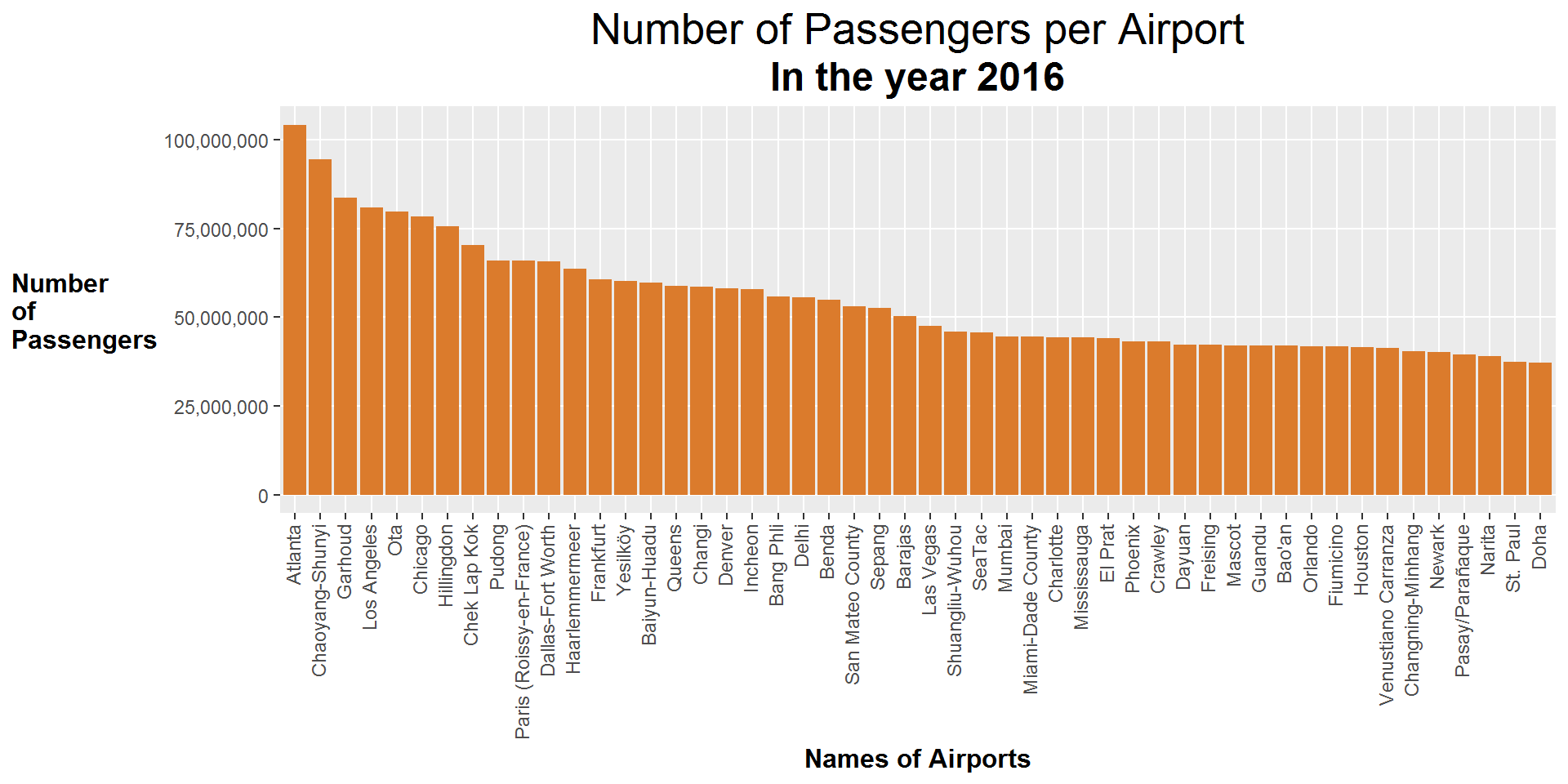
In 2016, how many airports in the top 50 are located in America?
# barplot of United States airports against Others in 2016
df.busiestAirport %>%
    mutate(usAirport = ifelse(country == "United States", "US","Others")) %>%
    filter(year == 2016) %>%
    ggplot(aes(x=reorder(city, desc(total.passengers)), y=total.passengers)) +
    geom_bar(stat="identity", aes(fill=usAirport)) +
    scale_y_continuous(labels = scales::comma_format()) +
    scale_fill_manual(values=c("#db7b2c","#5ea774")) +
    labs(title="32% of Busiest Airports in 2016") +
    labs(subtitle = "are in United States") +
    labs(x="Airports", y="Number \nof \nPassengers") +
    theme.widebar +
    theme.generalText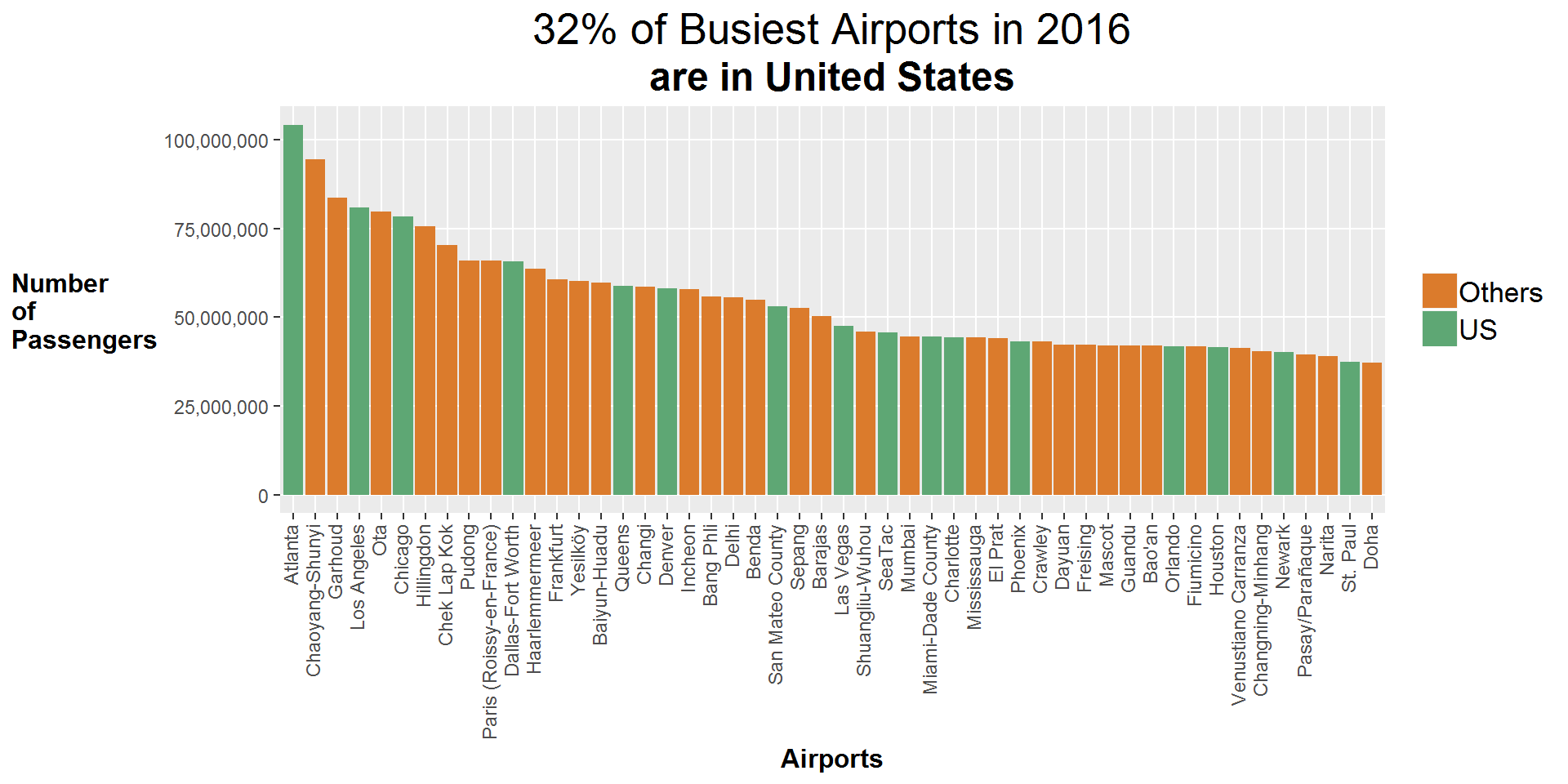
In 2016, how many airports in the top 50 are located in China?
# barplot of Chinese airports against Others in 2016
df.busiestAirport %>%
    mutate(chinaAirport = ifelse(country == "China", "China","Others")) %>%
    filter(year == 2016) %>%
    ggplot(aes(x=reorder(city, desc(total.passengers)), y=total.passengers)) +
    geom_bar(stat="identity", aes(fill=chinaAirport)) +
    scale_y_continuous(labels = scales::comma_format()) +
    scale_fill_manual(values=c("#5a6069","#db7b2c")) +
    labs(title="16% of Busiest Airports in 2016") +
    labs(subtitle = "are in China") +
    labs(x="Airports", y="Number \nof \nPassengers") +
    theme.widebar +
    theme.generalText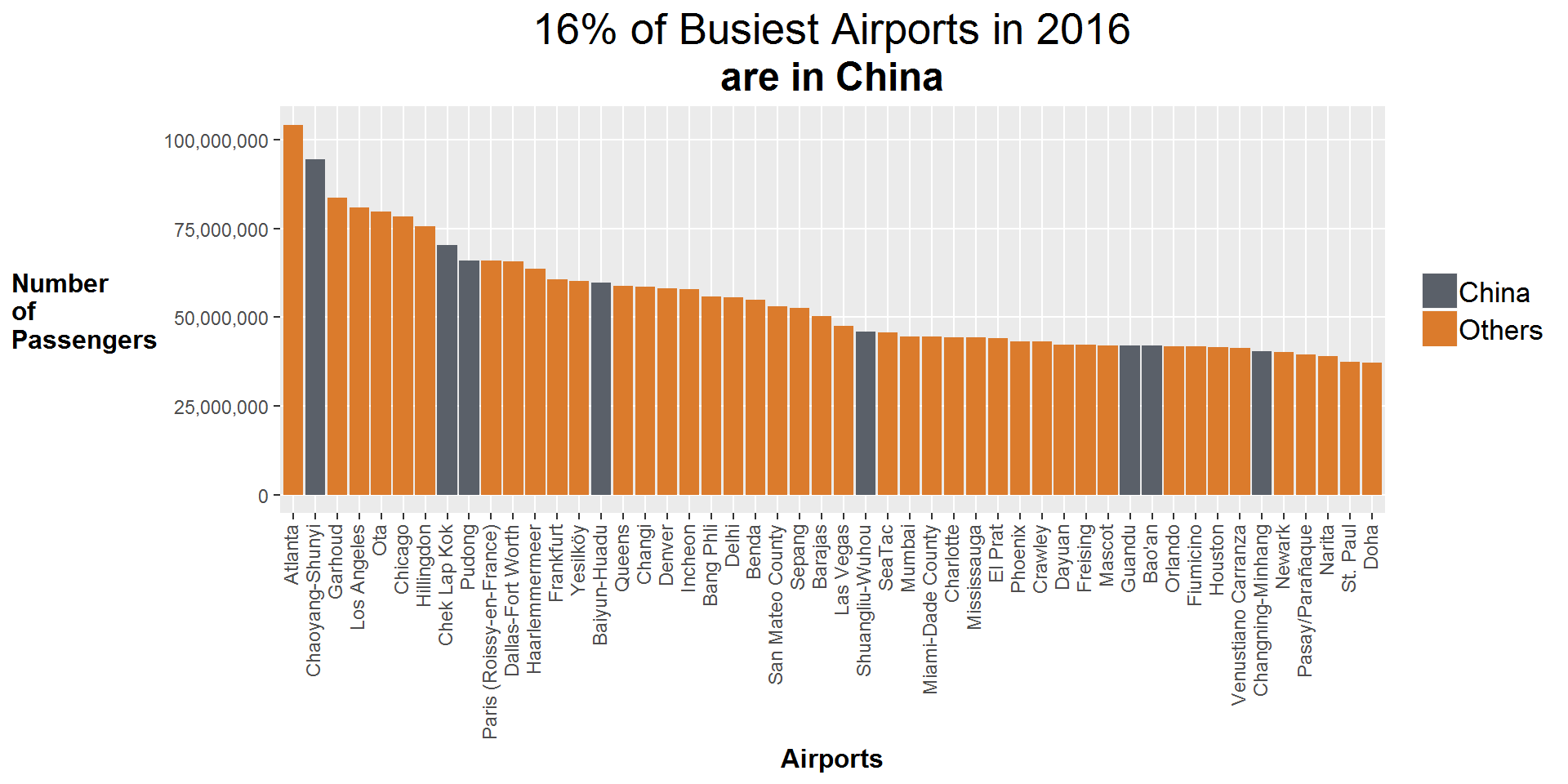
The case of China vs the United States.
China and United States are viewed as powerhouses in the world economy. United States is viewed as “the land of green pastures” where people have nurtured intentions to travel to. China on the other hand is the world’s most populous country with a Gross Domestic Product (GDP) growth of close to 10% annually.
From the barplots above, we can tell that 48% (32 + 16) of passengers used airports located in China or the United States in the year 2016.
First let us plot the growth or otherwise
# Line chart for China and United States
df.UsChina %>%
    group_by(year, country) %>%
    summarise(YearlyPass = sum(total.passengers)) %>%
    ggplot(aes(x= year, y=YearlyPass, group=country)) +
    geom_line(aes(color=country), size=1.2) +
    scale_color_manual(values=c("#5a6069","#5ea774")) +
    scale_y_continuous(labels = scales::comma_format()) +
    labs(title="United States has much more passengers using their airports") +
    labs(subtitle = "China's airports have seen consistent increase in numbers") +
    labs(x="Year", y="Number\nof \nPassengers") +
    theme.generalText +
    theme(legend.title = element_blank()) +
    theme(legend.text = element_text(size=13))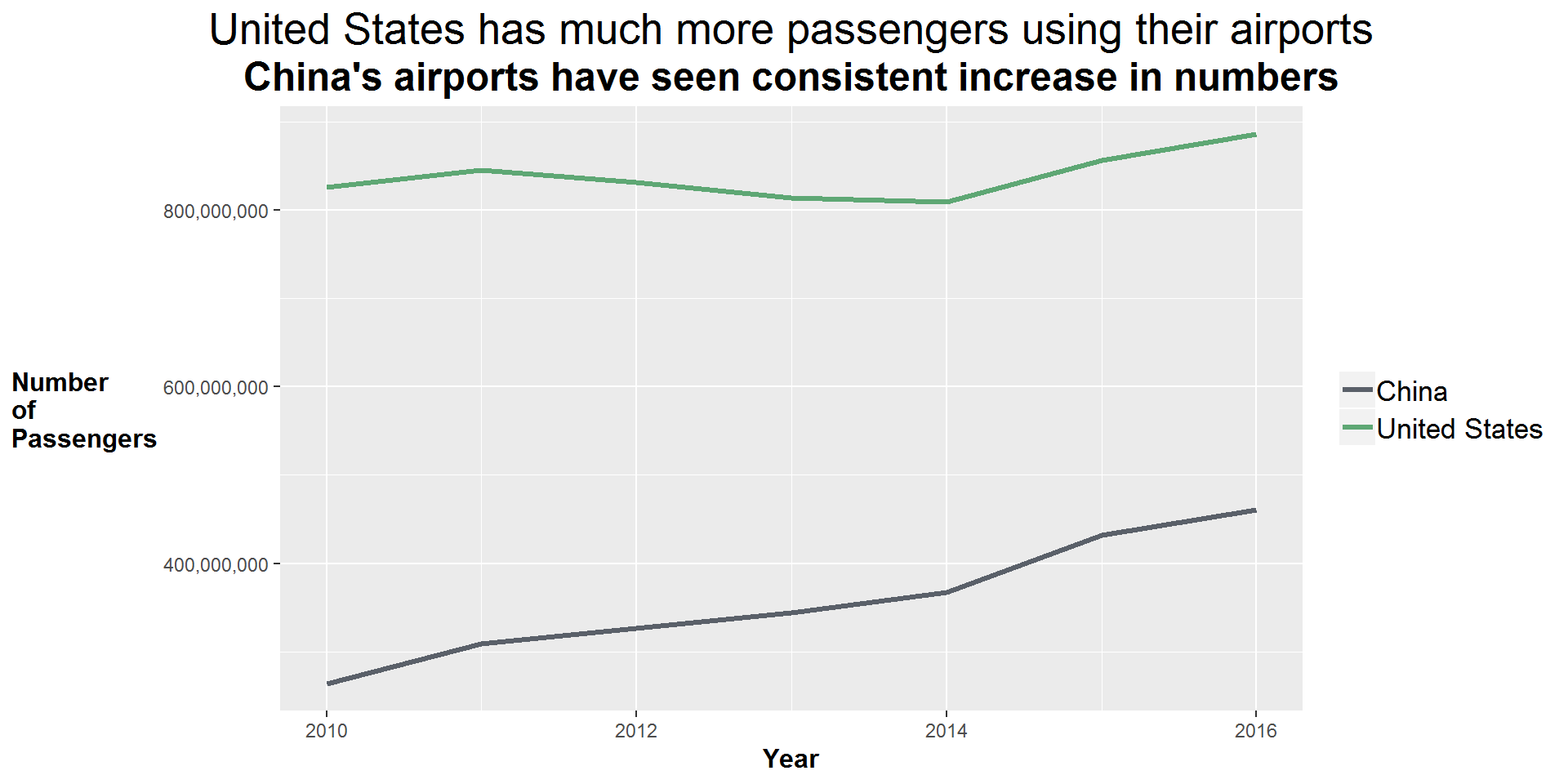
The line chart clearly shows that United States have more passengers using their airports.
A boxplot of total passengers will help us understand the distribution of airports per each country.
df.UsChina %>%
    group_by(year, country) %>%
    ggplot(aes(x= country, y=total.passengers, group=country)) +
    geom_boxplot() +
    scale_y_continuous(labels = scales::comma_format()) +
    labs(title="75% of US Airports had less than 57 million passengers from
         2010-2016") +
    labs(subtitle="China is highly variable as compared to US") +
    labs(x="Country", y="Number \nof \npassengers") +
theme.generalText 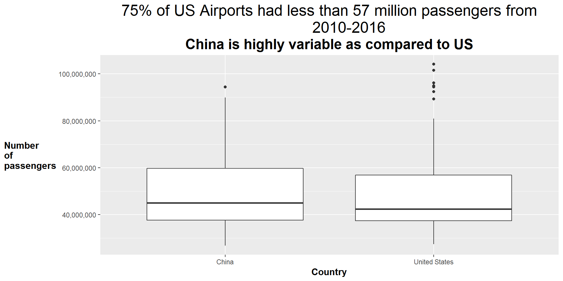
Statistical values for Boxplot
Below are values for the median, 1st, median and 3rd quartiles
#=================STATISTICS=============================================

#quartiles (Q1, Q2 [median], Q3) for China and United States
df.UsChina %>%
    group_by(country) %>%
    summarise(Q1 = quantile(total.passengers, probs=0.25),
              Q2 = quantile(total.passengers, probs=0.50),
              Q3 = quantile(total.passengers, probs=0.75))
## # A tibble: 2 x 4
## country Q1 Q2 Q3
## <fct> <dbl> <dbl> <dbl>
## 1 China 37570598 44960252 59701464.
## 2 United States 37413728 42340461 56827154American airports with capacity higher than Chinese’s biggest airport
The maximum number of passengers who used a Chinese airport is 94,393,454.
df.UsChina %>%
    filter(country == "China") %>%
    summarise(max(total.passengers))
## max(total.passengers)
## 1 94393454The code below finds which American airports have higher values than this.
The Hartsfield-Jackson Atlanta Airport completed expansion to accomodate 100 million people in 2013 and is currently number 1 wrt to capacity for passengers
df.UsChina %>%
    filter(total.passengers > 94393454) %>%
    select(airport, location)
## airport location
## 1 Hartsfield–Jackson Atlanta International Airport Atlanta, Georgia
## 2 Hartsfield–Jackson Atlanta International Airport Atlanta, Georgia
## 3 Hartsfield–Jackson Atlanta International Airport Atlanta, Georgia
## 4 Hartsfield–Jackson Atlanta International Airport Atlanta, Georgia
## 5 Hartsfield–Jackson Atlanta International Airport Atlanta, GeorgiaWho gained and who lost?
The values for China and United States have flattened the plots for other countries. Excluding these 2 countries, let us see if there are other stories to be told.
df.busiestAirport %>%
    filter(country != "United States", country != "China") %>%
    group_by(country,year) %>%
    summarise(YearlyPass = sum(total.passengers)) %>%
    ggplot(aes(x=year, y=YearlyPass, group=country)) +
    geom_line(color="#db7b2c", size=1.3) +
    facet_wrap(~country) +
    scale_y_continuous(labels=scales::comma_format()) +
    labs(title = "Some interesting observations") +
    labs(subtitle = "Australia's Dip from 2012\nJapans Dip and Rise 2010-2012\nIs Dubai a factor in UAE's rise?") +
    labs(x="Year", y="Number\nof\nPassengers") +
    theme.smallMulti +
    theme.generalText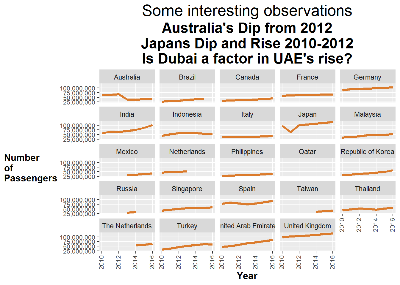
No show for Qatar?
One can clearly observe that there is no line chart for Qatar. It has a single row which corresponds to the year 2016. According to Wikipedia and their website, the airport was opened to the public in 2014 with a capacity for 30 million people.
df.busiestAirport %>%
    filter(country == "Qatar") %>%
    select(year, airport, location, country, total.passengers)
## year airport location country total.passengers
## 1 2016 Hamad International Airport Doha Qatar 37283987